Spreading our Wings with Brighton Festival 2015 Branding
As we swoop headfirst into another jam-packed year of festival goodness we thought we’d tell you a bit more about Brighton Festival 2015’s avian branding.
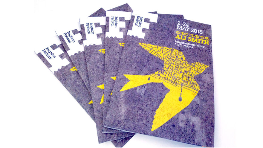
You may have noticed our yellow, big bird, but there’s no hint of Sesame Street about it. Working with our Guest Director Ali Smith and agency Johnson Banks to create this striking, bespoke identity has been a lot of fun.
Drawing inspiration from Ali’s words and this year’s theme has led us to our final design. See Ali Smith’s welcome for the full introduction to the concepts behind this Festival’s programming, which include Art & Nature, Crossing Places and Taking Liberty.
Our designer’s Johnson Banks spoke of their inspiration and direction, ‘This year’s image was inspired by guest director Ali Smith’s words and thoughts on her themes for the festival. She says ‘Imagine the world seen from the eye of a bird’, and talks specifically about swifts as they migrate to the UK in May. This fits perfectly with the time of year the festival takes place.
We felt swifts were also a great analogy for the artists coming together from all over the world to perform at the festival. So we imagined how Brighton could look from a swift's perspective. As it flies overhead it casts a yellow shadow of the city itself on the ground. The swift graphic is designed with flexibility in mind, to ‘fly' over various parts of Brighton from the sea, to its parks, to the lanes and streets. For the principal image, we enjoyed the harsh contrast of the swift’s vibrant colour against the stark concrete street, perhaps symbolising the diversity of the festival itself.’
Here’s a little insight into the design process...
So now you know - why not take inspiration and enjoy the view at this year’s Brighton Festival? See the full and fantastic line-up here.