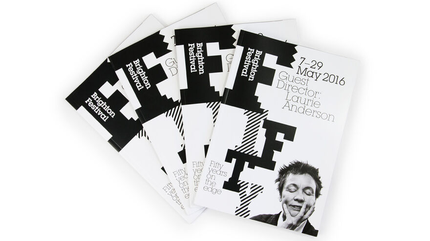
Brighton Festival 2016 branding: Fifty years on the edge
What’s black and white and read all over? The 50th Brighton Festival brochure…
Working to create our striking monochrome 50th identity has been a lot of fun. Here’s what designers Johnson Banks said about their inspiration and direction,
‘This year Brighton Festival asked us to create a special identity to celebrate their fiftieth year. It really was a gift for us, that their current F logo could become the initial letter for 'FIFTY' in a one-off logotype.
The festival has always celebrated the experimental, unusual and cutting edge in the arts, wanting to disrupt the quotidian. So the 'FIFTY' marque began from there - avoiding the traditional, and sitting on the edge, literally and figuratively. The vertical type, chevrons and diagonal cut letters add to the dislocated effect. This year's line 'Fifty years on the edge' developed from the same starting point.
Laurie Anderson, the Guest Director for 2016, herself an experimental performance artist, is a perfect fit with the festival ethos for their golden year.’ The design process in progress: